Smilezone Foundation & Every Child Deserves to Smile
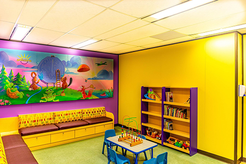
Smilezone Brand Colours
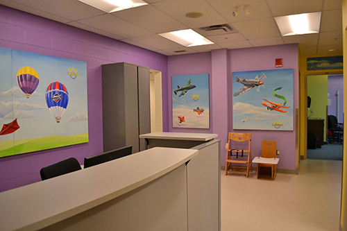
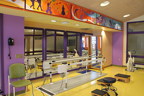
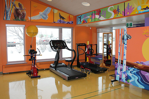
While every Smilezone is unique, our brand colours stay consistent. We put a lot of thought into the Smilezone palate, purposefullychoosing specific shades of purple and yellow. When selecting tones to use in our Smilezones we take into account the children who will be using the spaces first. We are careful to omit triggering colours when designing Smilezones for grieving children, and purposefully select shades to accommodate various sensory needs.
Purple and yellow are stimulating colours – particularly for children with Autism Spectrum Disorder. While we want to create a calming space for children, color stimulation in the health care environment can improve attention and fine motor processes resulting in more successful therapy treatment. In contrast, monotone coloured surroundings such as the default “hospital beige” can create restlessness, difficulty in concentration, and irritability; increasing anxiety and decreasing the success and willingness of the child to participate in their therapy.We ensure that while purple and yellow are stimulating, the specific tones we use do not cause overstimulation in the children receiving treatment.
When it comes to paediatric healing environments everything makes a difference, including paint colours!